


Scope And Constraints
The new Biosensor was required to have its own app separate from the main One Drop app. This was because the FDA considers the app itself as part of the medical device sold alongside the hardware.
My Contributions
UI UX Design
Tools: Figma
Product Rendering & Animation
Tools: Keyshot, Adobe After Effects
Video Story Board And Shooting For App And HardwareTutorials
Sensor Management and Data
Sensor Management
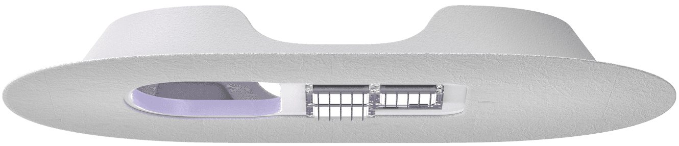
The biosensor's dual-battery system, two units charged in sequence to maintain 24-hour wear, was tricky for a non-tech-savvy T2 audience. We kept instructions simple, focusing on wear time rather than percentages, always surfacing the status of the off sensor battery to remind the user to keep it charged.
For tutorials, rather than lean on static diagrams or text instructions, we opted for a step by step talking-head video tutorial format. We workshopped a full storyboard before shooting ourselves, covering unboxing, application, and recurring wear.


Live Data
For the data interface we deliberately pulled from established CGM conventions, using a cleaner version of the 3-hour line graph and range visualisation familiar from Dexcom and Abbott, to avoid alienating users migrating from other platforms.
Multi-data support was architected similarly to Apple Health's card model: data types surface as active or inactive cards depending on what the sensor is currently measuring, keeping the interface uncluttered for single-condition users while remaining extensible for future data types.


2. Future Proofing The Brand




3. Scalable Health Platform
Scope And Constraints
The Biosensor opened the opportunity to serve T2 and other conditions with the same hardware platform. Therefore we needed a digital strategy that could adapt to multiple use cases.
An iterative approach had to be taken to avoid suspending service to existing users.
My Contributions
Worked directly with C-Suite team on conceptualizing a Biosensor enabled platform.
Worked with product management and engineering to create an iterative development road map.
Leading design team to set up an adaptable UI system.
Tools: Figma


Scalable product strategy
The north star was replacing data-heavy dashboards, inappropriate for our audience, with a flexible card feed that surfaces the right action at the right moment, guiding users through their health journey without requiring them to interpret raw data themselves.


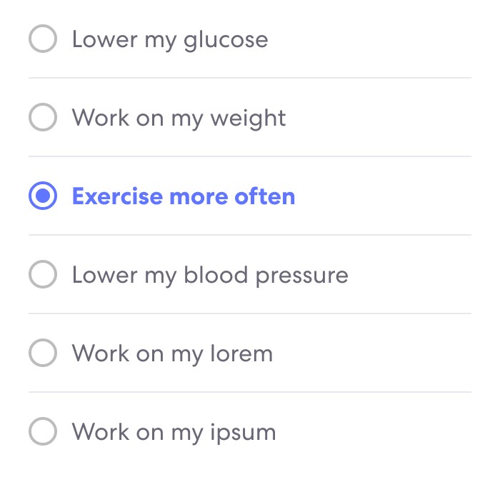
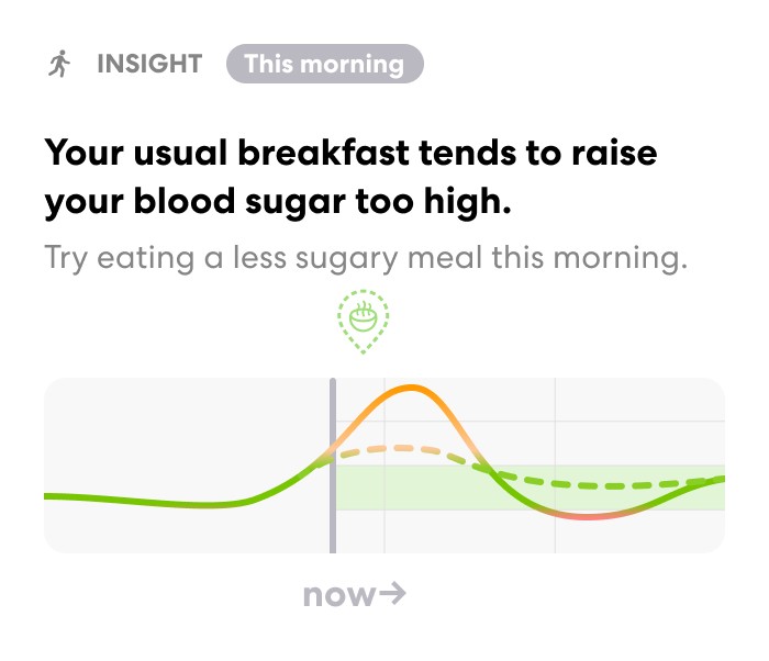

Roadmap for Integration Into The Existing Platform
We approached the transition in three deliberate phases.
First, we built robust data visualization capabilities so the platform could surface meaningful visual correlations.
Second, we introduced fixed program tracks to re-engage users following diagnosis, providing structured guidance during the highest-anxiety period.
Third, we developed trend-detection logic to generate contextual nudges outside of structured programs, maintaining engagement without demanding perpetual attention from users.


Conclusion
Over two years we successfully brought a novel CGM system to clinical trials, rebuilt the brand around a multi-condition platform vision, and architected a scalable digital health ecosystem.
Mert Erdir
Design
My co-founder at Temple Design, we worked in tandem on creative direction for the brand as well as ideating solutions and executing on the App designs.
Rick Vlaha & Josh Knowles
Design and Engineering
For helping to create a flexible and robust design style system as well as a scalable component system for the digital platform.
Sarah Kang & Sara Huneke
Brand
For collaborating on creating the One Health brand direction and establishing a strong brand voice and visuals.
Ashwin Pushpala & Matthew Chapman
Hardware
For building the hardware technology which enabled this project.
The Biosensor Team
Hardware
For working together to establish the specifications for the sensor app and how it would interact with the hardware.